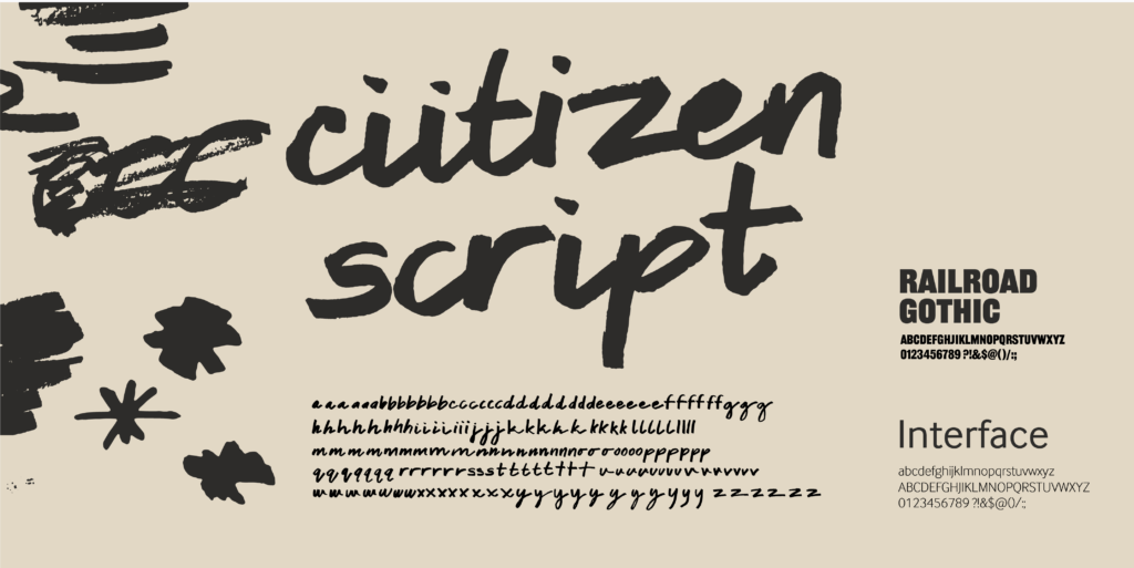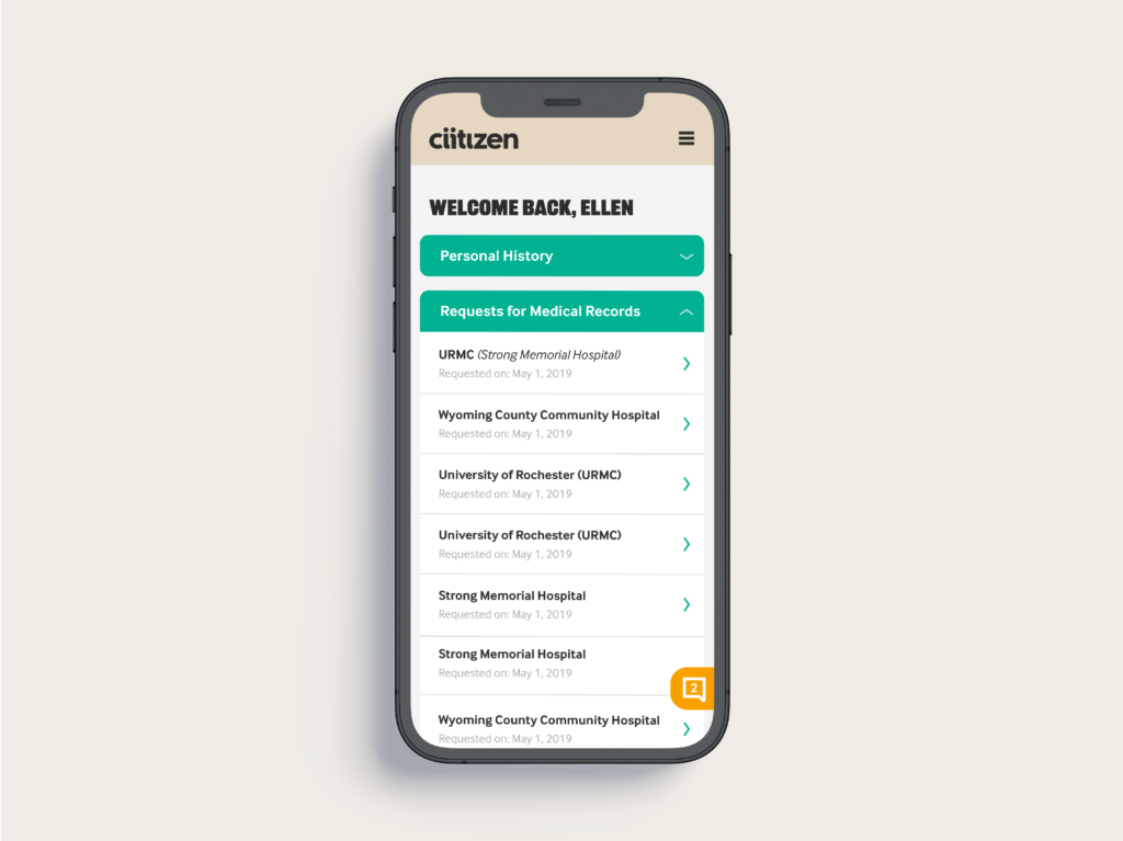
A bold brand for a company empowering cancer patients with their records.
Ciitizen is a free service that helps patients get more out of their health records. Their platform enables patients to find better treatment options and allows them the opportunity to advance the research for
cures. When you control your data, you have more options. For your own care, and to advance research for others.

The logo
The simplified, clean lines of the wordmark set it apart against the other branding elements. The double “I” in the wordmark is a potent and unique symbol. It reflects Ciitizen’s cyclical nature, where individuals fuel the community, and the community supports the individual.
The Ciitizen wordmark is a direct evolution of the original logo. It keeps the interactive letter “I”s but moves from a more disconnected and elitist font to a contemporary, bold one.


Ciitizen’s colors are bold and impactful, a radical departure from the sea of blues and greens that most healthcare companies inhabit. The secondary colors bring in positivity and hope.


